I’ve spent a lot of time. Too much time, really, looking at the "back end" of websites for private practice owners. I’ve seen the panic that sets in when a new regulation drops. It usually starts with a vague email from a professional association or a scary headline about lawsuits. Right now, the big one on the horizon is the Department of Health and Human Services (HHS) update to Section 504.
The deadline is May 2026. A proper website accessibility audit for your private practice is the fastest way to know exactly where you stand before enforcement kicks in. If your private practice receives any form of federal financial assistance, which often includes Medicare or Medicaid reimbursements, your digital presence needs to meet specific accessibility standards. Running a proper website accessibility audit for your private practice is the clearest way to know where you stand and what to fix first.
I know you already have a million things on your plate. You’re managing cases, navigating insurance panels, and trying to maintain your own nervous system. The last thing you need is a complex technical project that feels like learning a second language. But here’s the thing. Accessibility isn't just about avoiding a penalty. It is about making sure that the person in a crisis, or the neurodivergent seeker looking for a safe space, can actually use your site to get help.
At Transference Studio, we use the SPACE method (Strategy, Presence, Authority, Clarity, and Ease) to build systems that work. Accessibility fits right into "Presence." It’s about creating a calm, client-centered experience for everyone.
Quick Start: 3 Steps to Take Today
- Check your contrast: Use a free tool to see if your text is easy to read against your background.
- Test your keyboard: Try to navigate your homepage using only the "Tab" key. If you get stuck, your clients will too.
- Mark the calendar: Set a reminder that May 2026 is the hard deadline for HHS compliance.
Why a Website Accessibility Audit Is Now a Private Practice Priority
For a long time, website accessibility felt like a "nice to have" for many small practices. It was something that big hospitals or universities handled. That changed recently when the HHS finalized rules that bring web content under the umbrella of federal nondiscrimination laws.
If your website isn't accessible, it is now legally seen as a barrier to care. This isn't just about vision impairment either. It’s about people with motor disabilities who can’t use a mouse. It’s about neurodivergent individuals who find flashing animations or cluttered layouts physically overwhelming.
By the way, this is not legal advice. You should always consult with a qualified professional regarding your specific legal obligations. However, from a web design and SEO perspective, the path forward is clear. We need to audit, document, and fix.
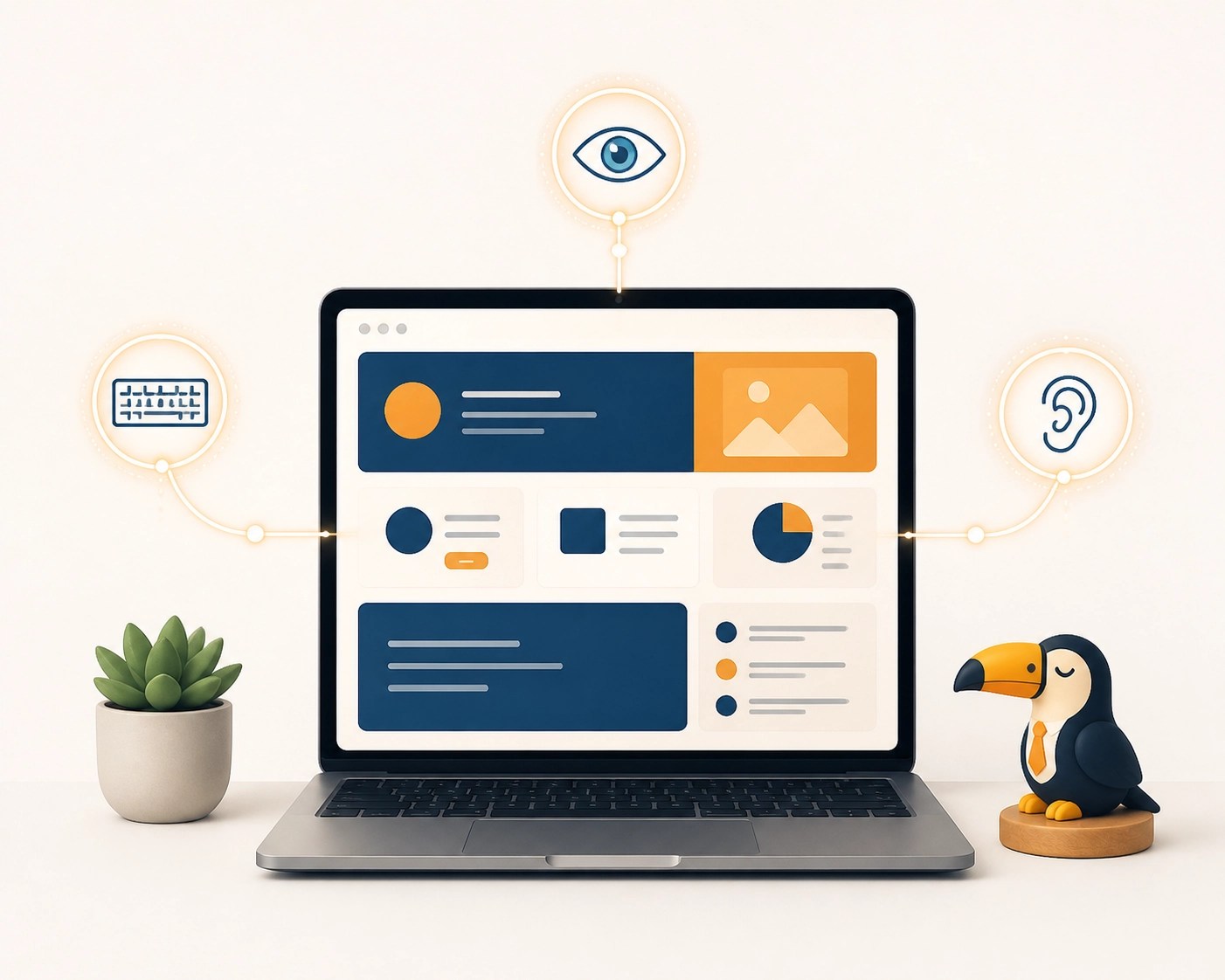
Prompt: A warm, inviting home office desk with a laptop showing a clean, high-contrast website layout, symbolizing a calm approach to digital accessibility.
Step 1: Define Your Technical Standards (The WCAG Baseline)
Before you start clicking buttons, you need a rulebook. The gold standard for web accessibility is the Web Content Accessibility Guidelines (WCAG), published by the W3C. The ADA web guidance aligns closely with these standards for healthcare settings.
For the HHS deadline in May 2026, the standard you generally need to aim for is WCAG 2.1 Level AA. Some experts suggest looking ahead to WCAG 2.2, as it includes more protections for people with cognitive and learning disabilities.
When we talk about "Strategy" in our SPACE method, this is where it begins. You aren't just guessing if a font is big enough. You are measuring it against a set of international standards that ensure your site is:
- Perceivable: Users can see or hear the content.
- Operable: Users can navigate the site easily.
- Understandable: The information and the UI are clear.
- Robust: The site works with a variety of assistive technologies.
If you’re here for more about Transference Studio and how we handle these technical details, just know that we build this baseline into every project.
Step 2: Define Your Environments and Assistive Tech
You can’t just look at your website on your own MacBook and call it a day. An audit requires testing how your site "behaves" in different environments.
People use the web in vastly different ways. A blind potential client might use a screen reader like NVDA on Windows or VoiceOver on a Mac. A person with a hand tremor might use a specialized keyboard or voice control software.
To do a proper audit, you should test on:
- Browsers: Chrome, Safari, and Firefox.
- Devices: A desktop computer, an iPhone, and an Android tablet.
- Assistive Tech: At the very least, turn on the built-in screen reader on your phone and try to navigate your "Contact" page.
It feels clunky at first. But when you hear a screen reader struggle to announce a "Schedule Now" button because it wasn't labeled correctly, the "why" behind this work becomes very real.
Step 3: Define Your Audit Scope (Don’t Try to Fix Everything at Once)
If you have a blog with 200 posts, don't panic. You don't necessarily have to audit every single page by hand. In the world of "Ease" and "Clarity," we focus on the high-impact areas first.
Identify your most important user flows. For a private practice owner, these usually include:
- The Homepage.
- Your "About" or "Meet the Team" page.
- Your Services pages.
- The Contact or Intake form.
- Any landing pages for specific specialities.
Usually, auditing 7 to 15 key pages gives you a clear picture of the global issues affecting your whole site. If your header navigation is broken on the homepage, it’s probably broken on every page. Fix it once, and you’ve made a massive leap toward compliance.
Step 4: Conduct the Evaluation (The Hybrid Method)
This is the "Authority" part of the process. You need to use a mix of automated tools and manual testing.
Automated Testing:
Tools like WAVE (Web Accessibility Evaluation Tool) or Google Lighthouse are great for a quick scan. They can catch things like missing "alt text" on images or low color contrast. They are fast and helpful, but they only catch about 30% to 40% of accessibility issues.
Manual Testing:
This is where the real work happens. You need to sit down and try to use your site without a mouse.
- Can you see where the "focus" is as you tab through links?
- Do your forms have clear labels that a screen reader can identify?
- Are you using "click here" as link text? (Please don't do that. It’s a nightmare for accessibility).
As a private practice owner, you want your site to feel like a warm invitation. If a user gets "trapped" in a popup menu they can't close with their keyboard, that presence is lost.

Step 5: Compile Your Report and Remediation Plan
Once you’ve found the issues, you need to document them. This isn't just for your own organization. It is also a way to show "good faith" efforts toward compliance if an agency ever asks.
Create a simple spreadsheet. List the page, the issue, the WCAG criteria it violates, and how high of a priority it is.
- Critical: Broken forms, non-navigable menus.
- High: Missing alt text on important images, poor color contrast.
- Medium: Missing labels on non-essential decorative elements.
If you want this built for you, the website design team at Transference Studio can handle the audit and the fixes in one streamlined process.
The Transference Approach: Neurodiversity and Inclusion
At Transference Studio, we go beyond just "checking boxes" for HHS. We believe in neurodiversity-affirming design. This means we think about how your website affects the sensory experience of your clients.
Many private practice owners serve clients with ADHD, Autism, or trauma histories. A website with auto-playing videos, bright flashing colors, or confusing jargon can trigger a "flight" response.
We prioritize:
- Consistent Navigation: So the user always knows where they are.
- Clear Language: Avoiding clinical "psychobabble" that creates a barrier.
- Sensory-Friendly Design: Using a palette that is professional but calming.
This approach builds "Authority" and "Trust" before the client even books their first consultation. It shows you’ve thought about their needs from the very first click.
Your Accessibility Audit Checklist
Use this mini SOP to keep your practice on track as we head toward the May 2026 deadline.
- Technical Standard: Confirmed site aims for WCAG 2.1 Level AA.
- Contrast Check: Used a tool like WebAIM to verify text-to-background ratios.
- Keyboard Navigation: Verified all links and buttons can be reached via "Tab" key.
- Alt Text: Added descriptive text to all images that convey information.
- Form Labels: Ensured every input field (Name, Email, etc.) has a visible, coded label.
- Headings: Checked that H1, H2, and H3 tags are used in a logical, nested order.
- Mobile Accessibility: Verified buttons are large enough to tap easily on a phone.
- No Autoplay: Disabled any videos or audio that start automatically.
If you’re not sure what to fix first, start with an audit. It is the only way to know where you truly stand before the regulations tighten up.
Running a practice is demanding. You shouldn't have to be a web developer on top of everything else. If you want a partner to navigate these changes with you, we’re here to help.

Prompt: A professional, friendly man in a modern office, representing the supportive and expert guidance of Transference Studio.
Want me to map this to your site in 20 minutes? Reach out to us here. We can take the technical weight off your shoulders so you can get back to the work that actually matters.