Why Simple Website Design for Therapists Converts Better
Effective website design for therapists isn’t about looking impressive. It’s about removing every barrier between a hesitant visitor and a booked session. Here’s why simplicity, not more pages or more polish, is what actually grows a practice.
Visitors form an impression of your site in milliseconds, and clutter kills trust before your copy even loads. Anxious visitors need a clear headline, simple navigation, and an obvious way to contact you, not more pages or more polish. Simplifying a site’s design and readability is consistently one of the highest-leverage changes a practice can make to its booking rate.
Key takeaways
- Clutter kills trust before your copy loads. Visitors form an impression in milliseconds, and a busy homepage reads as chaos, not professionalism.
- Readability is a conversion lever. Copy written at a 5th to 7th grade level converts at more than double the rate of dense, jargon-heavy writing.
- Simple doesn’t mean boring, it means intentional. Clean layouts, white space, and one clear message per section create the psychological safety anxious visitors need to act.
- Visual hierarchy drives bookings. A clear header, one homepage message, and obvious contact options at every step turn browsers into inquiries.
- Simplifying your site often beats spending more on ads. Fixing a low conversion rate maximizes the value of traffic you already have.
Your website probably has too much going on. I say this because I’ve rebuilt dozens of therapy practice sites over the years, and the pattern is consistent. Studies from the Nielsen Norman Group on user attention show that visitors form an impression in milliseconds. Clutter kills trust before your copy even loads. Clinicians add more pages, more images, more text blocks, thinking it will help potential clients understand their approach. Instead, it does the opposite.
Simple website design for therapists isn’t about being trendy or minimalist for aesthetic reasons. It’s about removing friction for anxious visitors who are already struggling to take the first step toward getting help.
Quick start: three changes you can make today
Before we dig into the research, here’s what you can do right now. These aren’t personality changes to your brand. They’re friction removers.

Why complexity is costing you clients
Let’s talk numbers for a second. Top-performing therapy websites convert 15% to 25% of visitors into inquiries. That means if you get 100 visitors this month, you should be hearing from 15 to 25 of them. If you’re seeing 2% to 3% conversion rates instead, that’s not a traffic problem. That’s a design problem.
The gap between those numbers is real money. If you’re paying for Google Ads or SEO to drive traffic, a poorly converting site means you’re burning budget on visitors who leave confused or overwhelmed. Fixing conversion through simpler design means you maximize the value of visitors you already have, without spending more on ads.
I’ve watched this play out repeatedly. A practice gets 200 visitors a month and books three new clients. After streamlining their site, with a clearer services page, simpler contact flow, and better mobile experience, they book 12 to 15 clients from the same traffic level. Same marketing spend. Different outcome.
The readability factor nobody talks about
Here’s something most designers miss. When your website copy is written at a 5th to 7th grade reading level, the median conversion rate is 10.8%. When complexity increases to a 10th to 12th grade level, conversion rates drop by more than half.
This isn’t about dumbing things down. It’s about clarity. Therapy clients are already navigating anxiety, decision fatigue, and often shame about seeking help. Your website shouldn’t add cognitive load on top of that.
Look at your services page right now. Are you using phrases like “evidence-based modalities” or “integrative therapeutic framework”? Those might feel professionally accurate, but they create distance. Compare that to: “I use CBT and EMDR to help you work through anxiety and past trauma.” Same information. Half the cognitive effort.
How visual clutter breaks trust
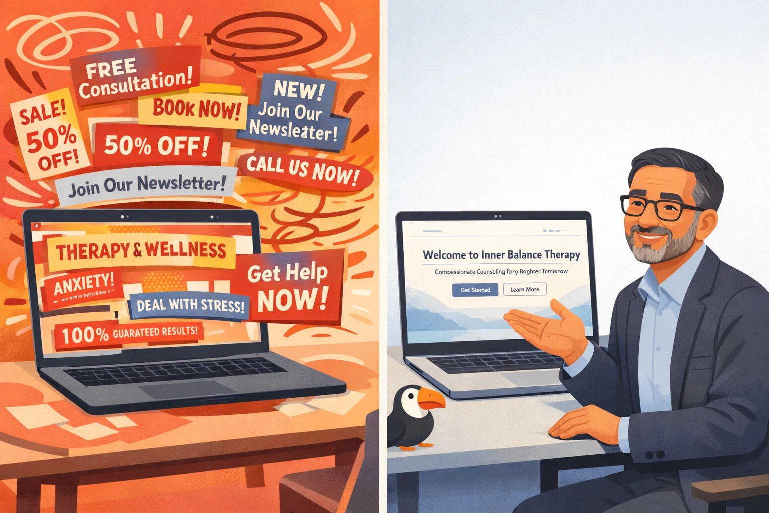
A cluttered, busy website sends the wrong message to potential clients before they read a single word. If your homepage has rotating testimonials, three different fonts, auto-playing videos, a pop-up within five seconds, and six different call-to-action buttons, you’re not communicating professionalism. You’re communicating chaos.
Mental health clients need to feel they’re in a safe, calm, professional space before they’ll commit to contacting you. Your website is their first impression of what working with you will feel like. If it’s overwhelming, they assume the experience will be too.
This is where website design for therapists differs from other industries. You’re not selling a product. You’re offering a relationship. The design needs to communicate presence, not urgency.
Simple doesn’t mean boring. It means intentional. Clean layouts with plenty of white space, one clear message per section, and obvious next steps create the psychological safety anxious visitors need to take action.
Clear hierarchy means more booked sessions
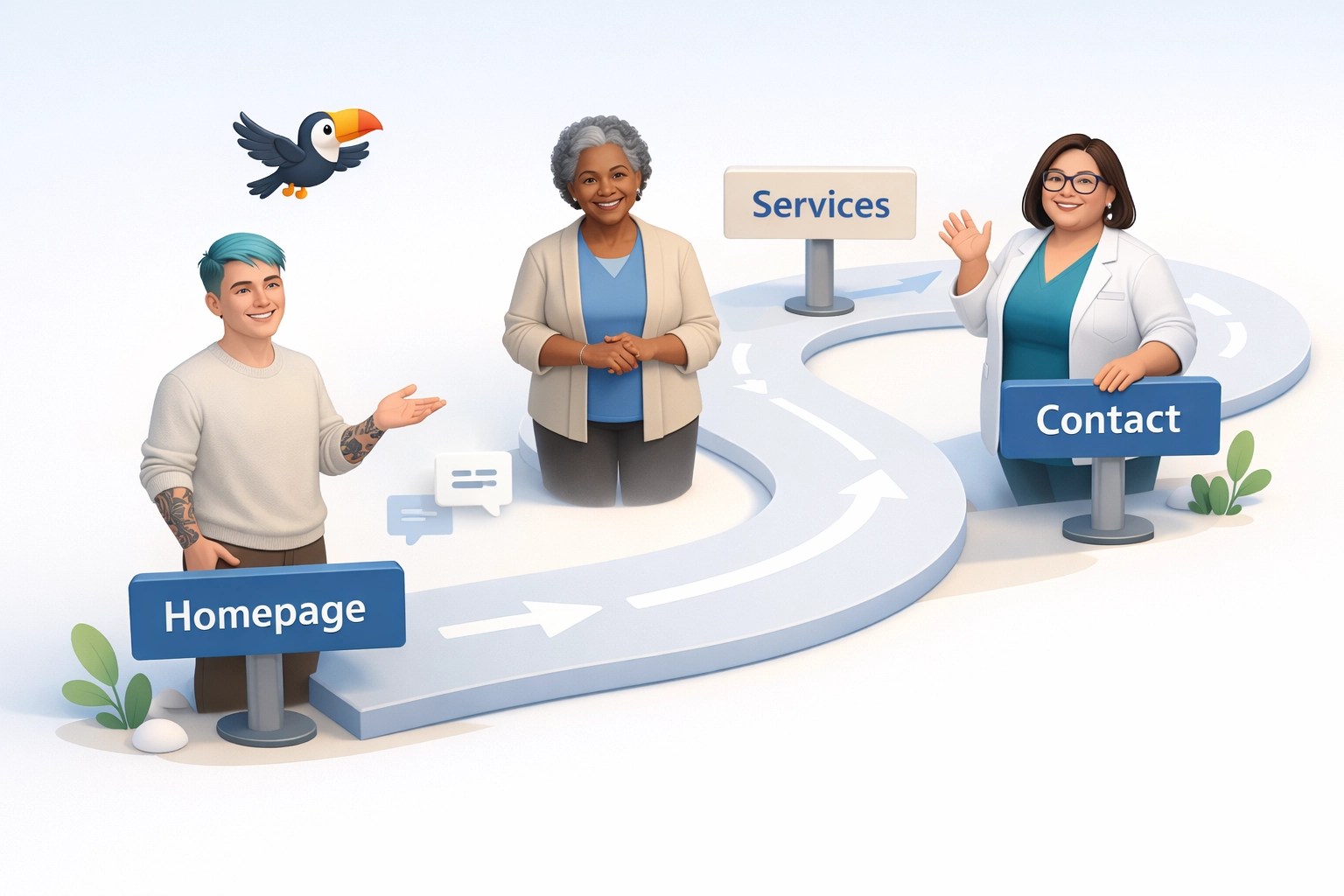
Anxious visitors need clear signals about where they are on a page and easy ways to convert at multiple points in their journey. This is where visual hierarchy matters. Here’s what that looks like in practice.
Header: logo, simple navigation, phone number (clickable on mobile), and a “Book Consultation” button.
Homepage: one clear headline explaining who you help and how, a short paragraph, and a primary call-to-action. That’s it above the fold.
Services page: each service gets a clear subheading, two to three sentences of explanation, and a “Learn More” or “Book Now” link.
Contact opportunities: phone number in the header, a contact form mid-page on relevant pages, and a scheduling link in the footer. Let people reach out when they’re ready, not just when you think they should.
The mistake I see most often is burying contact options. If someone has to click three times to find your email or phone number, you’ve lost them. Make conversion pathways obvious and accessible throughout the site.
The real ROI of simple design
One healthcare practice redesigned their site with patient-centric simplicity as the core principle. Their conversion rate went from 4.87% to 14.77%, a 203% increase, and the primary driver was making the experience clearer and less overwhelming.
For a therapy practice seeing 300 visitors a month, that same improvement would mean going from 15 inquiries to 44. If your consultation-to-client conversion rate is even 50%, that’s an additional 15 paying clients per month. Do the math on your session rate, and you’ll see why making more money as a therapist often starts with simpler design, not more marketing spend.
This is where the SPACE method shows up naturally. Systems means understanding and automating your conversion funnel. Presence means creating a calm, client-centered experience. Accessibility ensures every visitor, regardless of ability, can actually use the site. Clarity is the structure itself. And Engagement is what happens when you remove unnecessary steps between “I need help” and “I booked a session.”
If you’re not sure where your site falls short, start with an honest audit. Open your homepage on your phone right now. Pretend you’re an anxious potential client. Can you figure out what you do, who you help, and how to contact you in under 10 seconds? If not, that’s your starting point.
Your simple design checklist
Run through this checklist to evaluate your current site or guide a redesign. If more than four items are unchecked, your site is likely costing you clients right now. The good news is most of these are fixable without a full redesign.
Navigation & structure
Homepage clarity
Contact & conversion
Readability & accessibility
Visual simplicity & page speed
You don’t need a flashy website to grow your practice. You need one that gets out of the way and lets anxious, hopeful people take the next step without added friction.
Want a second opinion on your site?
We map this to your specific site in about 20 minutes. No pressure, just practical next steps.
See Our Website Design ServicesDoes simple website design mean my site has to look boring?
What’s the fastest change I can make to improve conversions?
Why does reading level affect conversion rate?
How do I know if my website is too complicated?
Sources
- Nielsen Norman Group. Website Response Times. nngroup.com/articles/website-response-times