
Private Practice Branding 101: Naming, Look & Voice
Your brand is the digital handshake that tells potential clients whether you understand their world before they ever walk through your door. This guide covers the three pillars of private practice branding: naming, visual identity, and voice.
Private practice branding is not a logo. It is the system of signals that communicates your values, your niche, and your cultural responsiveness before a client ever speaks to you. Getting the name, color palette, and voice right reduces the barrier to booking for the exact clients you are built to serve.
Key takeaways
- Branding is the foundation of clinical safety. A well-branded practice tells potential clients they belong before the first session starts. Specificity builds trust faster than trying to appeal to everyone.
- Your practice name is the most permanent brand decision you will make. If you plan to scale or hire associates, avoid naming the practice after yourself. A standalone brand name is more transferable.
- Cultural appropriation in naming carries real consequences. Avoid sacred words or symbols from cultures you do not belong to. Grounded, universal metaphors serve every community without appropriating any.
- Accessible color and typography are clinical tools, not design extras. High-contrast palettes serve clients with low vision, ADHD, and dyslexia. Calm does not mean illegible.
- Your brand will evolve as you do. A brand that is 80 percent honest and genuinely yours outperforms a polished brand that feels like a mask. Start with your values and refine from there.
You are staring at a blank legal pad, trying to distill twenty years of clinical training and human empathy into a two-word business name. Every name you think of is either already taken by a conglomerate or sounds like a generic spa in a hotel lobby. You want to sound professional but not cold. You want to be inclusive but not performative. This is the heavy lifting of private practice branding, and it usually happens before you ever see your first client in your new space.
Branding as a Clinical Foundation, Not a Luxury
Branding is often sold as something you do after you become “successful.” In reality, branding is the foundation of clinical safety. It is how a potential client knows they can bring their whole self to your office before they ever click the book now button. For a private practice owner, your brand is the digital handshake that communicates whether you understand their specific context.
Most clinicians view branding as a superficial layer of paint: a font, a logo, a color that feels calming. But in the mental health field, branding is about trust signals. A generic brand asks the client to do the cognitive work of guessing whether you are the right fit. A specific, culturally responsive, and warm brand has already answered that question for them before they read a single word of your bio. This is especially meaningful for clients navigating high anxiety or executive function challenges. The clearer your brand, the lower the barrier to reaching out.
Naming Your Practice: What Sticks and What to Avoid
The name of your practice is the most permanent part of your brand. While you can change your website colors or update your headshot, changing your legal business name involves paperwork, redirects, and client confusion. You want to get this right the first time.
Many clinicians default to their own name. “Jane Doe Therapy” is easy and safe, but it can make scaling harder if you ever want to bring on associates. It also says nothing about what you do or who you serve. When brainstorming private practice name ideas, move away from pathology-based language. Words like “Clinic” or “Treatment Center” feel cold and institutional to someone who is not yet comfortable identifying as a patient.
Look instead for words that imply movement, connection, or groundedness. Rooted Connection, The Mosaic Collective, Bridge and Path Therapy. These names invite rather than diagnose. They suggest a process without implying that the person seeking help is broken.
Avoiding Cultural Appropriation in Naming
This is a critical and often overlooked part of building a culturally responsive practice. Do not use sacred words or symbols from cultures you do not belong to. If you are not Indigenous, your practice should not be named “Spirit Journey.” If you do not have a deep, lived connection to a specific language, avoid using its terms as a branding choice.
The harm here is real. When a clinician uses borrowed cultural language without lived connection, it signals to clients from that culture that they may not be fully seen or understood. It also signals to everyone else that the practice values the aesthetic of a culture over its actual people.
Instead, look for universal metaphors that resonate with the specific communities you serve. If you work primarily with immigrant families, names evoking home, roots, or bridges are powerful without being appropriative. If you work with neurodivergent adults, names suggesting clarity, navigation, or systems can speak to that experience without pathologizing it.
Before finalizing a name, ask a trusted colleague from each cultural community the name references to read it and share their first impression. You are not asking for permission. You are testing whether the name lands the way you intend it to.
Building Your Visual Identity: Color and Typography
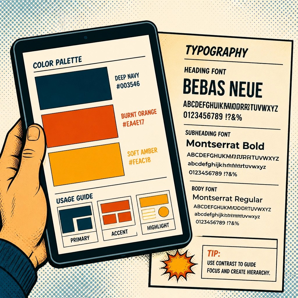
Once you have a name, you need a visual identity. Your colors and typography are the first things a visitor processes when they land on your site, often before they read a single word. For a private practice owner, these choices should be guided by accessibility first and emotional resonance second.
Many therapy sites use clinical blue or hospital white, which can feel sterile and medicalized. Others swing into the wellness space with soft pastels that look calming but fail basic contrast requirements for low-vision users. Deep greens, warm earth tones, and rich navies tend to work well. They feel grounded and professional without triggering the anxiety that clinical whites and blues can carry. Most importantly, run your palette through a contrast checker before committing to it. High contrast is not a design trend. It is a requirement for a neurodiversity-affirming practice.
Typography carries a similar weight. A playful handwritten font might feel approachable, but it can be genuinely difficult to read for someone with dyslexia. A rigid serif font may signal authority but also distance. Choose a clean, readable sans-serif for your body text. Save more expressive typefaces for headings, and even then, prioritize legibility over personality. Your text should feel like a calm conversation, not a design statement.
Writing Your Brand Voice: Like a Human, Not a Textbook
Your brand voice is the tone of your writing. It shows up in your About page, your intake forms, your FAQ answers, and your voicemail greeting. Most therapist and healthcare websites sound like a textbook. They are dense with clinical terminology and passive sentences that create distance rather than connection.
To create a voice that resonates with the specific people you serve, write for the person rather than the diagnosis. Use “you” and “I.” Speak directly to the pain points and the hopes your clients bring through the door. Compare these two sentences: “We provide evidence-based interventions for mood disorders.” versus “We help you navigate the heavy days with tools that actually fit your life.” The second version sounds like a person talking to another person. It removes the clinical power dynamic that often makes therapy feel inaccessible before it even begins.

Integrating Cultural Responsiveness Throughout Your Brand
Cultural responsiveness is not a badge you pin to your website. It is the thread that runs through every branding decision you make. This means being explicit about who you serve and what your values are, not just in a mission statement, but in your imagery, your copy, your intake language, and the visual cues you choose.
If you are an anti-racist practice, say so clearly. If you are LGBTQ+ affirming, make sure that is visible in your imagery and your copy, not buried in the fine print of an insurance page. Use photos that represent a wide range of bodies, ages, abilities, and family configurations. Avoid the stock photo look: three people laughing over a salad or a white woman meditating on a cliff. Those images feel performative and alienate clients who do not see themselves in those scenes.
Many private practice owners worry that being specific about who they serve will turn people away. The opposite is true. When you are clear about your values and your niche, you attract clients who feel genuinely understood rather than tolerated. You are not narrowing your market. You are deepening your connection to the people you can most effectively serve.

Your Brand Is a Living Thing
Your brand will evolve as you do. You might start as a solo practitioner and grow into a group practice. Your niche might shift from young adults to perinatal care, or from general anxiety to working specifically with first-generation college students. Branding decisions that felt right in year one may not reflect who you are in year five.
Do not let the fear of imperfection stop you from starting. A brand that is 80 percent there but feels genuinely honest is far more effective than a polished brand that feels like a performance. You can update your colors, rewrite your copy, and refine your voice as your practice and your clinical identity develop. The goal is to build a foundation of honesty and inclusion that holds across those updates.
Once your visual identity and voice are in place, the next challenge is making sure the right people can find you. Our guide to local SEO for therapists walks through exactly how your brand connects to your online visibility strategy.
Your Private Practice Branding Checklist
Use these eight actions to audit your current brand or build a new one. Most can be completed in under 20 minutes.
Ready to build a brand your ideal clients recognize themselves in?
We design websites and brand identities for private practice and healthcare providers that balance clinical credibility with genuine human warmth.
Start the Conversation